
THE CONSULTANTS who came up with Blackburn’s new logo are scratching their heads after an almost identical version was used to promote a town in Cumbria.
The two PR companies involved say they have no idea why the two images are so similar.
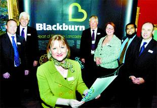
The distinctive heart-shaped letter ‘B’ is a central part of Blackburn’s £60,000 marketing campaign that was unveiled in May.
Manchester-based design agency Creative Lynx is behind the logo, which is displayed in empty shop windows in King William Street as part of a drive to “change perceptions” of the town.
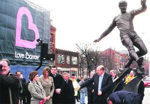
But it has emerged Barrow Borough Council, which employed Kendal-based Cactus Creative to come up with a logo for its Love Barrow campaign, has been displaying a remarkably similar version outside its town hall.
Steve Nicholas, a director of Creative Lynx, said he “did not have a clue” where the Barrow logo had come from.
He added: “I know there was an initiative in Barrow a few years ago where they had a heart with a couple of lines through it - now this one has popped up.
“It looks to me as if the Barrow one is a civic pride thing. I don’t think it impacts on Blackburn in any way.
“Ours is more wide ranging, and I think looks a lot better.”
Blackburn’s logo, which aims to show the town is “a major player in England’s North West”, was discussed by the town centre board in August 2007.
Niki Plimley, a senior account manager for Cactus Creative, said she had never seen the Blackburn logo.
She added: “I was not aware of what they were doing, but I will have a look at it.”
Their logo was first approved in January and had been on show in Barrow since March 17, she added.
Creative Lynx was appointed last year to come up with a new ‘brand’ for Blackburn.
It was given £60,000 to find out how best to market the town. Staff came up with the logo and a marketing campaign.
The firm once drove the world’s largest Valentine’s card between Manchester and Liverpool as a publicity stunt, and also worked with Preston Council to raise its profile after it became a city.
Council bosses believe Blackburn’s new brand will increase visitor numbers and support the retail, fashion, food and drink and leisure sectors in the town.
Are branding logos a waste of money? Add your comments below.


Comments: Our rules
We want our comments to be a lively and valuable part of our community - a place where readers can debate and engage with the most important local issues. The ability to comment on our stories is a privilege, not a right, however, and that privilege may be withdrawn if it is abused or misused.
Please report any comments that break our rules.
Read the rules hereLast Updated:
Report this comment Cancel